Documentation UX: Why It Matters More Than Accurate Content Alone


When a user lands on your documentation, they’re looking for answers. If they hit a wall of text with no starting point or see steps that assume knowledge they don’t have yet. Within minutes, they’ll be frustrated and say it's a bad product.
Believing that if the content is accurate and up to date, the docs are good is wrong. The docs being accurate is a starting point. In this article, we’ll dive into what documentation user experience (UX) is, how writing and structure shape it, what having bad documentation UX costs for your product, and how to improve it.
What Is Documentation UX?
Documentation User Experience(UX) is the overall experience users have while interacting with your documentation. It goes beyond the layout, color schemes, or which static site generator you used. It includes how content is structured, how language is used, how the navigation works, and most importantly how well the documentation meet the users where they are.
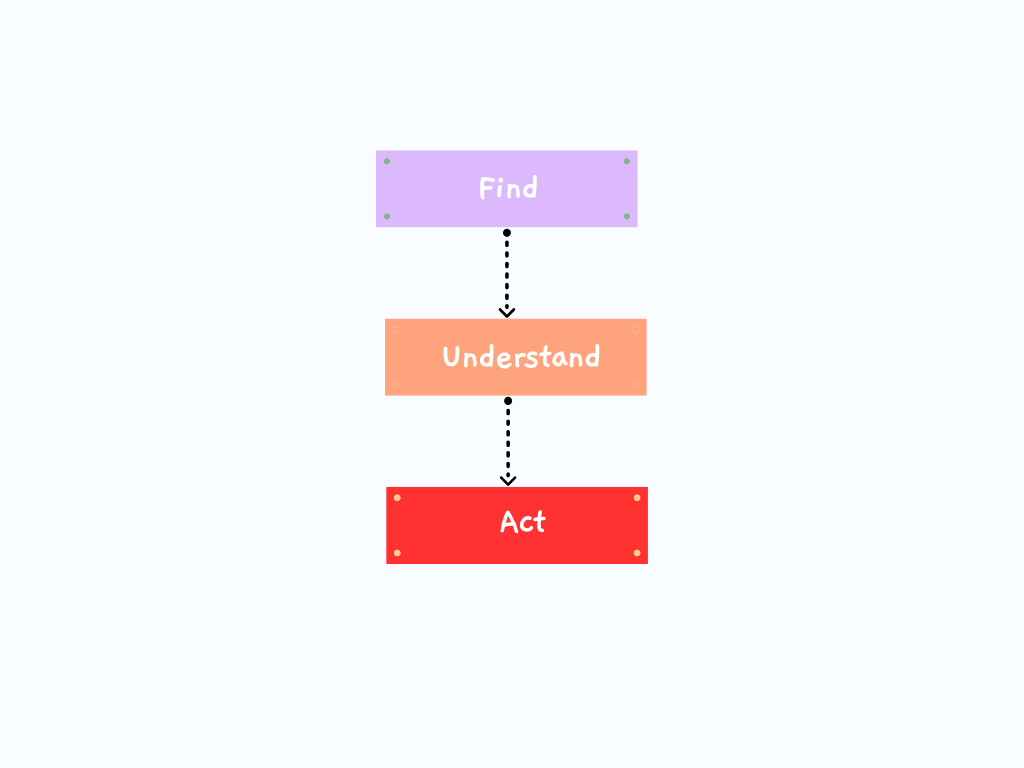
Good documentation UX helps users answer three questions quickly:
- Am I in the right place?
- Do I understand what I'm reading?
- What should I do next?
The moment the answer to any of these questions becomes “I’m not sure”, the experience has already started to crack. And once that crack forms, users rarely stick around for you to fix it.
How Writing and Structure Shape Documentation UX
Documentation UX problems can arise from writing too close to the product. When you build a feature, you understand it deeply, but the users don’t, and that deep understanding can be a blind spot. You’ll write docs that make perfect sense to someone who already knows how everything fits together. But for a new user discovering it for the first time, that's a different story.
These patterns show over and over again:
- There's no clear starting point for new users.
- Pages assume background knowledge users haven't picked up yet.
- Critical steps get buried inside long, dense paragraphs.
- Navigation reflects how the internal team thinks, not how users actually search for answers.
The content itself might be technically correct, but if users can’t easily act on it, the documentation still fails them.
Good documentation UX shows up in the little things users never have to think about like clear headings that guide their eyes, sections that unfold in a predictable order, and language that doesn't make them pause and re-read.
The choice of words, tone, and sentence structure all shape how quickly users absorb information. Using short sentences helps users scan, familiar words lower the barrier to understanding, and the active voice makes the instructions easier to follow. Following these doesn’t mean you should dumb things down. It means you should be intentional as a writer.
When it comes to structure, users don’t read documentation top to bottom. They jump in from a search result, scan for what they need, and move on. The pages in your documentation needs to support that kind of behaviour. Clear headings, predictable section order, and logical grouping let users locate content fast. Strong documentation UX comes from deliberate choices: deciding what users need first, what can wait, and what doesn't belong on the page at all.
The Hidden Cost of Poor Documentation UX
When documentation UX is poor, the damage spreads quickly. Users will take longer to onboard, and you’ll have support tickets piling up with questions the docs should have answered. You’re losing trust in the documentation and pushing the users to other sources like Stack Overflow, community forums, or even worse, a competitor with better docs.
Over time, users will not say “The documentation UX is bad”. They’ll frame it as:
- "This is confusing."
- "This tool is hard to use."
- "I couldn't get it to work."
Each of these statements makes it sound like the product has a problem. And in a way, it does because documentation is a product. This shapes how people feel about what you've built, whether they consciously realize it or not.
How to Start Improving Your Documentation UX Today
You don't need a redesign, a new tool, or a bigger team to start making documentation UX better. Small, focused changes go a long way.
- Watch a new user navigate the docs without guidance. Just observe and you’ll notice where they hesitate, where they click, and where they give up. This alone will reveal more than any internal review.
- Review your landing pages and entry points. These are the first things users see. If they don't immediately communicate "here's where to start," you're already losing them.
- Rewrite one confusing section with clarity in mind. Pick the page that generates the most support questions and rework it. Focus on plain language, logical order, and remove assumptions.
- Audit your headings and page flow for scannability. Read just the headings on a page. Ask yourself if they tell a coherent story and if someone scanning them will understand what the page covers and find what they need. Then make changes based on those findings.
When you apply small changes like these over time, there’ll be a noticeable difference in how users experience your documentation and your product.
Final Thoughts
Documentation is part of your product experience. Treating it that way through thoughtful UX, clear writing, and intentional structure changes how people interact with everything you build. And once you start seeing your docs through a UX lens, you won't want to go back.